


# Introduction
Every analysis starts the same way: you load a dataset and try to figure out what’s actually in it. How many rows? Which columns are numeric? How much is missing? Is anything wildly skewed? Most of us answer those questions by copy-pasting the same df.describe(), df.isna().sum(), and df.groupby(...).agg(...) snippets we’ve typed a thousand times, then reformatting the output by hand when it’s time to drop it into a report.
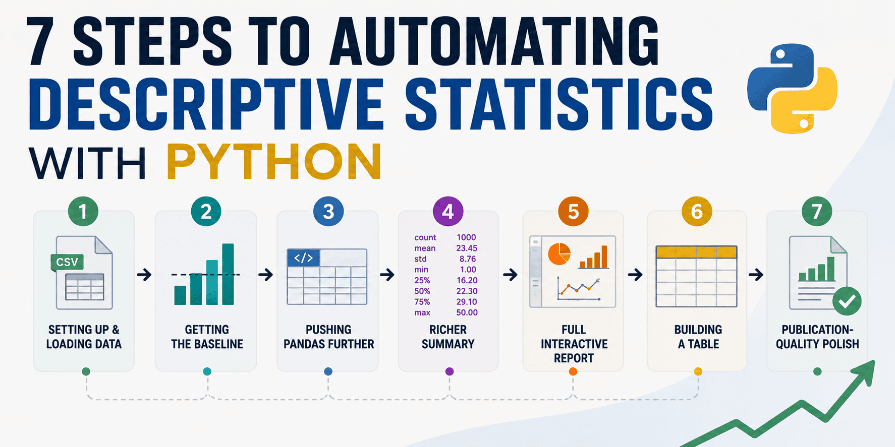
That’s wasted effort. The Python ecosystem now has tools that take you from a raw DataFrame to a formatted, shareable summary table in one or two lines — and others built specifically to produce the kind of “Table 1” that you mostly see in research papers. This tutorial walks you through the 7 steps to build a repeatable pipeline rather than a pile of one-off snippets. We’ll use the Palmer Penguins dataset throughout. It’s small, it’s open, and it has a realistic mix of numeric and categorical columns, real missing values, and a natural grouping variable (species). So let’s get started.
# 1. Setting Up Your Environment and Loading the Data
Install the packages we’ll use in this tutorial:
pip install pandas seaborn skimpy tableone great-tables fg-data-profiling
An important note on the last one: the popular profiling library has been renamed more than once. It was initially pandas-profiling, became ydata-profiling in 2023, and was renamed again to fg-data-profiling in April 2026. The older ydata-profiling package still installs and runs, but it no longer receives updates, so new projects should prefer fg-data-profiling. We’ll cover both import styles in Step 5.
Now load the data. Seaborn has a built-in penguins dataset, which saves us a download:
import pandas as pd
import seaborn as sns

df = sns.load_dataset("penguins")
print(df.shape)
print(df.dtypes)
print(df.isna().sum())
Output:
(344, 7)
species               object
island                object
bill_length_mm       float64
bill_depth_mm        float64
flipper_length_mm    float64
body_mass_g          float64
sex                   object
dtype: object
species               0
island                0
bill_length_mm        2
bill_depth_mm         2
flipper_length_mm     2
body_mass_g           2
sex                  11
dtype: int64
You’ll see seven columns: three categorical (species, island, sex) and four numeric measurements (bill_length_mm, bill_depth_mm, flipper_length_mm, body_mass_g). The measurements have 2 missing values each, and sex has 11. Hold onto this detail — we will see how each tool reports this missing data.
# 2. Getting the Baseline with df.describe()
Pandas’ built-in describe() is the obvious starting point, and for good reason. It’s instant and requires no additional installation:
Output:
       bill_length_mm  bill_depth_mm  flipper_length_mm  body_mass_g
count          342.00         342.00             342.00       342.00
mean            43.92          17.15             200.92      4201.75
std              5.46           1.97              14.06       801.95
min             32.10          13.10             172.00      2700.00
25%             39.22          15.60             190.00      3550.00
50%             44.45          17.30             197.00      4050.00
75%             48.50          18.70             213.00      4750.00
max             59.60          21.50             231.00      6300.00
This is genuinely useful, but notice its blind spots. By default it ignores categorical columns entirely. It gives you a count of non-null values but never tells you the missing percentage directly. And it stops at the five-number summary — no skewness, no kurtosis, no sense of distribution shape. For a quick gut check it’s fine, but as the foundation of a report it leaves gaps. The next step closes some of them without leaving Pandas.
# 3. Pushing Pandas Further with include, .agg(), and groupby
Before reaching for external packages, it’s worth knowing how far Pandas alone can take you — because for a lot of everyday work, this is enough.
First, fold the categorical columns into the same summary with include="all":
df.describe(include="all").round(2)
Output:
       species island  bill_length_mm  bill_depth_mm  flipper_length_mm  body_mass_g   sex
count      344    344          342.00         342.00             342.00      342.00   333
unique       3      3             NaN            NaN                NaN         NaN     2
top     Adelie Biscoe             NaN            NaN                NaN         NaN  Male
freq       152    168             NaN            NaN                NaN         NaN   168
mean       NaN    NaN           43.92          17.15             200.92     4201.75   NaN
std        NaN    NaN            5.46           1.97              14.06      801.95   NaN
min        NaN    NaN           32.10          13.10             172.00     2700.00   NaN
25%        NaN    NaN           39.22          15.60             190.00     3550.00   NaN
50%        NaN    NaN           44.45          17.30             197.00     4050.00   NaN
75%        NaN    NaN           48.50          18.70             213.00     4750.00   NaN
max        NaN    NaN           59.60          21.50             231.00     6300.00   NaN
Now you get unique, top, and freq for the text columns alongside the numeric stats (with NaN filling the cells where a statistic doesn’t apply). One table, every column.
Second, build a custom summary with .agg() so you control exactly which statistics appear — including ones describe() omits, like skewness and kurtosis — and bolt on a missing-data percentage:
numeric = df.select_dtypes("number")

summary = numeric.agg(["mean", "median", "std", "skew", "kurt"]).T
summary["missing_pct"] = df[numeric.columns].isna().mean().mul(100).round(1)
summary.round(2)
Output:
                      mean   median     std  skew  kurt  missing_pct
bill_length_mm       43.92    44.45    5.46  0.05 -0.88          0.6
bill_depth_mm        17.15    17.30    1.97 -0.14 -0.91          0.6
flipper_length_mm   200.92   197.00   14.06  0.35 -0.98          0.6
body_mass_g        4201.75  4050.00  801.95  0.47 -0.72          0.6
Third — and this is the move people forget — chain groupby() in front of describe() to get a stratified summary in a single line:
df.groupby("species")["body_mass_g"].describe().round(1)
Output:
           count    mean    std     min     25%     50%     75%     max
species
Adelie     151.0  3700.7  458.6  2850.0  3350.0  3700.0  4000.0  4775.0
Chinstrap   68.0  3733.1  384.3  2700.0  3487.5  3700.0  3950.0  4800.0
Gentoo     123.0  5076.0  504.1  3950.0  4700.0  5000.0  5500.0  6300.0
The pattern to internalize: select_dtypes to choose columns, .agg([...]) to choose statistics, groupby to choose strata. This trio handles a surprising share of real reporting needs with zero dependencies. The remaining steps are about saving time, adding polish, and handling the cases where “good enough” isn’t.
# 4. Getting a Richer Console Summary with skimpy
When you want more than describe() but don’t want to assemble it by hand, skimpy is the right option. It is like a supercharged describe() that runs in your console or notebook and handles every column type at once. It works with both Pandas and Polars DataFrames.
from skimpy import skim

skim(df)
A single call prints a structured report: a data summary (row and column counts), a breakdown by data type, a numeric table with mean, standard deviation, the full percentile spread, and an inline ASCII histogram per column, plus a separate table for string columns showing things like character counts and most/least frequent values. Missing data is reported as both a count and a percentage, right where you’d expect it.
Output:
╭──────────────────────────────────────────────── skimpy summary ─────────────────────────────────────────────────╮
│          Data Summary                Data Types                                                                 │
│ ┏━━━━━━━━━━━━━━━━━━━┳━━━━━━━━┓ ┏━━━━━━━━━━━━━┳━━━━━━━┓                                                          │
│ ┃ Dataframe         ┃ Values ┃ ┃ Column Type ┃ Count ┃                                                          │
│ ┡━━━━━━━━━━━━━━━━━━━╇━━━━━━━━┩ ┡━━━━━━━━━━━━━╇━━━━━━━┩                                                          │
│ │ Number of rows    │ 344    │ │ float64     │ 4     │                                                          │
│ │ Number of columns │ 7      │ │ string      │ 3     │                                                          │
│ └───────────────────┴────────┘ └─────────────┴───────┘                                                          │
│                                                     number                                                      │
│ ┏━━━━━━━━━━━━━━━━━━━━┳━━━━┳━━━━━━━━━━━━━━━━━━━━┳━━━━━━━┳━━━━━━━┳━━━━━━┳━━━━━━━┳━━━━━━━┳━━━━━━┳━━━━━━┳━━━━━━━━┓  │
│ ┃ column             ┃ NA ┃ NA %               ┃ mean  ┃ sd    ┃ p0   ┃ p25   ┃ p50   ┃ p75  ┃ p100 ┃ hist   ┃  │
│ ┡━━━━━━━━━━━━━━━━━━━━╇━━━━╇━━━━━━━━━━━━━━━━━━━━╇━━━━━━━╇━━━━━━━╇━━━━━━╇━━━━━━━╇━━━━━━━╇━━━━━━╇━━━━━━╇━━━━━━━━┩  │
│ │ bill_length_mm     │  2 │ 0.5813953488372093 │ 43.92 │  5.46 │ 32.1 │ 39.23 │ 44.45 │ 48.5 │ 59.6 │ ▃█▆█▃  │  │
│ │ bill_depth_mm      │  2 │ 0.5813953488372093 │ 17.15 │ 1.975 │ 13.1 │ 15.6  │ 17.3  │ 18.7 │ 21.5 │ ▄▅▆█▆▂ │  │
│ │ flipper_length_mm  │  2 │ 0.5813953488372093 │ 200.9 │ 14.06 │ 172  │ 190   │ 197   │ 213  │ 231  │ ▂██▄▆▃ │  │
│ │ body_mass_g        │  2 │ 0.5813953488372093 │ 4202  │ 802   │ 2700 │ 3550  │ 4050  │ 4750 │ 6300 │ ▂█▆▄▃▁ │  │
│ └────────────────────┴────┴────────────────────┴───────┴───────┴──────┴───────┴───────┴──────┴──────┴────────┘  │
│                                                     string                                                      │
│ ┏━━━━━━━━━┳━━━━┳━━━━━━━━━━━━┳━━━━━━━━━━┳━━━━━━━━━━━┳━━━━━━━━┳━━━━━━━━━━━┳━━━━━━━━━━━━┳━━━━━━━━━━━┳━━━━━━━━━━━━┓  │
│ ┃ column  ┃ NA ┃ NA %       ┃ shortest ┃ longest   ┃ min    ┃ max       ┃ chars/row  ┃ words/row ┃ total words┃  │
│ ┡━━━━━━━━━╇━━━━╇━━━━━━━━━━━━╇━━━━━━━━━━╇━━━━━━━━━━━╇━━━━━━━━╇━━━━━━━━━━━╇━━━━━━━━━━━━╇━━━━━━━━━━━╇━━━━━━━━━━━━┩  │
│ │ species │  0 │ 0          │ Adelie   │ Chinstrap │ Adelie │ Gentoo    │ 6.59       │ 1.00      │ 344        │  │
│ │ island  │  0 │ 0          │ Dream    │ Torgersen │ Biscoe │ Torgersen │ 6.09       │ 1.00      │ 344        │  │
│ │ sex     │ 11 │ 3.19767442 │ Male     │ Female    │ Female │ Male      │ 4.99       │ 0.97      │ 333        │  │
│ └─────────┴────┴────────────┴──────────┴───────────┴────────┴───────────┴────────────┴───────────┴────────────┘  │
╰──────────────────────────────────────────────────────────────────────────────────────────────────────────────────╯
The inline histograms are the standout feature. You get a read on each distribution’s shape without opening a plotting library. For interactive exploration, skimpy is a good middle ground: far more informative than describe(), far lighter than a full HTML report.
# 5. Generating a Full Interactive Report with Profiling
When you need the complete picture — distributions, correlations, interactions, duplicate detection, and data-quality warnings — it is better to generate a full profile report. This is the one-liner that replaced an afternoon of exploratory plotting for a lot of analysts.
With the maintained package:
from data_profiling import ProfileReport          # fg-data-profiling

profile = ProfileReport(df, title="Penguins Profiling Report", explorative=True)
profile.to_file("penguins_report.html")
If you’re on the legacy package, only the import line changes:
import ydata_profiling # legacy ydata-profiling
The output is a self-contained, interactive HTML file with sections for an overview (size, memory, duplicate rows), per-variable detail (descriptive stats plus histograms), correlations across several coefficients, a missing-values analysis, and automatic alerts flagging skew, high cardinality, constant columns, and the like.

A section of the generated profiling report
The one tradeoff is speed: a full report computes a lot, and it slows down on large datasets. Two arguments fix that. Use minimal=True to switch off the most expensive computations, and profile a sample rather than the whole frame when you just need a feel for the data:
profile = ProfileReport(df.sample(frac=0.5), minimal=True)
There’s also a .compare() method for putting two datasets side by side — invaluable for spotting drift between a training set and production data, or between two time periods.
# 6. Building a Real “Table 1” with tableone
Everything so far is for you — exploration aids. tableone is for your readers. It produces the stratified baseline-characteristics table that opens nearly every clinical and quantitative research paper (hence “Table 1”), with the formatting and statistics that reviewers expect.
from tableone import TableOne

data = df.dropna(subset=["sex"])

columns     = ["bill_length_mm", "bill_depth_mm",
               "flipper_length_mm", "body_mass_g", "island", "sex"]
categorical = ["island", "sex"]
nonnormal   = ["body_mass_g"]   # summarize with median [IQR] instead of mean (SD)

table1 = TableOne(
    data,
    columns=columns,
    categorical=categorical,
    nonnormal=nonnormal,
    groupby="species",
    pval=True,
    smd=True,
)
print(table1.tabulate(tablefmt="github"))
The result is a properly formatted table: continuous variables as mean (SD), categoricals as n (%), anything you flagged as non-normal as median [Q1,Q3] — stratified across your grouping variable, with a missing-data column, p-values, and standardized mean differences (SMD) between groups:
|                              |           | Missing   | Overall                | Adelie                 | Chinstrap              | Gentoo                 | SMD (Adelie,Chinstrap)   | SMD (Adelie,Gentoo)   | SMD (Chinstrap,Gentoo)   | P-Value   |
|------------------------------|-----------|-----------|------------------------|------------------------|------------------------|------------------------|--------------------------|-----------------------|--------------------------|-----------|
| n                            |           |           | 333                    | 146                    | 68                     | 119                    |                          |                       |                          |           |
| bill_length_mm, mean (SD)    |           | 0         | 44.0 (5.5)             | 38.8 (2.7)             | 48.8 (3.3)             | 47.6 (3.1)             | 3.315                    | 3.023                 | -0.393                   | <0.001    |
| bill_depth_mm, mean (SD)     |           | 0         | 17.2 (2.0)             | 18.3 (1.2)             | 18.4 (1.1)             | 15.0 (1.0)             | 0.062                    | -3.022                | -3.220                   | <0.001    |
| flipper_length_mm, mean (SD) |           | 0         | 201.0 (14.0)           | 190.1 (6.5)            | 195.8 (7.1)            | 217.2 (6.6)            | 0.837                    | 4.140                 | 3.119                    | <0.001    |
| body_mass_g, median [Q1,Q3]  |           | 0         | 4050.0 [3550.0,4775.0] | 3700.0 [3362.5,4000.0] | 3700.0 [3487.5,3950.0] | 5050.0 [4700.0,5500.0] | 0.064                    | 2.885                 | 3.043                    | <0.001    |
| island, n (%)                | Biscoe    |           | 163 (48.9)             | 44 (30.1)              | 0 (0.0)                | 119 (100.0)            | 1.819                    | 2.153                 | nan                      | <0.001    |
|                              | Dream     |           | 123 (36.9)             | 55 (37.7)              | 68 (100.0)             | 0 (0.0)                |                          |                       |                          |           |
|                              | Torgersen |           | 47 (14.1)              | 47 (32.2)              | 0 (0.0)                | 0 (0.0)                |                          |                       |                          |           |
| sex, n (%)                   | Female    |           | 165 (49.5)             | 73 (50.0)              | 34 (50.0)              | 58 (48.7)              | <0.001                   | 0.025                 | 0.025                    | 0.976     |
|                              | Male      |           | 168 (50.5)             | 73 (50.0)              | 34 (50.0)              | 61 (51.3)              |                          |                       |                          |           |
The real payoff is export. A TableOne object goes straight to the format your manuscript needs — LaTeX (paste it into Overleaf), HTML, Markdown, or CSV:
table1.to_latex("table1.tex")
table1.to_html("table1.html")
table1.to_csv("table1.csv")
One important thing that the package authors stress, and so will I: automated statistics are not a substitute for judgment. The choice of which test to run, whether a variable is truly normal, and how to handle missingness all warrant human review before anything goes to publication. tableone removes the tedium, not the responsibility.
# 7. Polishing It into a Publication-Quality Table with Great Tables
tableone formats research tables specifically. For any other summary — a business report, a slide, or a README — Great Tables turns a plain DataFrame into a styled, presentation-ready table, the same way the gt package does in R. It takes a Pandas or Polars frame and renders to HTML or to an image.
Take the custom summary we built back in Step 3 and dress it up:
from great_tables import GT, md

numeric = df.select_dtypes("number")
stats = (numeric.agg(["mean", "median", "std", "min", "max"]).T
                .rename_axis("measurement").reset_index())
stats["missing_pct"] = df[numeric.columns].isna().mean().mul(100).values

table = (
    GT(stats, rowname_col="measurement")
    .tab_header(title="Penguin Body Measurements",
                subtitle="Descriptive statistics, Palmer Archipelago")
    .fmt_number(columns=["mean", "median", "std", "min", "max"], decimals=1)
    .fmt_percent(columns="missing_pct", decimals=1, scale_values=False)
    .data_color(columns="std", palette="Blues")
    .tab_source_note(md("Source: *palmerpenguins* dataset (Horst et al.)."))
)
A few things are happening here. fmt_number and fmt_percent handle display formatting so you never hand-round again. data_color applies a color gradient to the std column, drawing the eye to the most variable measurements. tab_header and tab_source_note add the title and attribution that make a table look finished. There’s plenty more — column spanners, conditional styling, even inline sparklines — but even this much produces something you’d happily put in front of stakeholders.
To use the result, render to an HTML string (works anywhere, no extra dependencies):
html = table.as_raw_html()
with open("summary_table.html", "w") as f:
    f.write(html)
The styled Great Tables output
# Tying It Together: One Function, Every Time
The whole point of automation is repeatability. Wrap the pipeline so the next dataset is a single call:
from great_tables import GT, md

def descriptive_report(df, decimals=1):
    numeric = df.select_dtypes("number")
    stats = (numeric.agg(["count", "mean", "median", "std", "min", "max"]).T
                    .rename_axis("variable").reset_index())
    stats["missing_%"] = df[numeric.columns].isna().mean().mul(100).values
    return (
        GT(stats, rowname_col="variable")
        .tab_header(title="Descriptive Statistics",
                    subtitle=f"{len(df):,} rows x {df.shape[1]} columns")
        .fmt_integer(columns="count")
        .fmt_number(columns=["mean", "median", "std", "min", "max"], decimals=decimals)
        .fmt_percent(columns="missing_%", decimals=1, scale_values=False)
        .data_color(columns="std", palette="Blues")
        .tab_source_note(md("Generated automatically with pandas + Great Tables."))
    )

descriptive_report(df)   # point it at any DataFrame
That’s the difference between a snippet and a tool: you write it once and reuse it on every dataset that lands on your desk.
# Wrapping Up
Descriptive statistics don’t have to be a chore you re-implement on every project. The ladder we climbed has a rung for every situation:
- Pandas
describe()and.agg(): Zero dependencies, perfect for quick checks and custom summaries. - skimpy: A richer console summary with histograms and missing-data percentages, in one call.
- fg-data-profiling: A complete interactive HTML report when you need the full exploratory data analysis (EDA) picture.
- tableone: The stratified “Table 1” with p-values and SMDs for research papers, with one-line export to LaTeX, HTML, and CSV.
- Great Tables: Polished, publication-quality styling for any summary you’ve produced.
Pick the lightest tool that answers your question. For a five-second sanity check, describe() wins. For a manuscript, tableone and Great Tables earn their keep. And once you wrap your favorite combination in a function, you stop doing descriptive statistics and start running them — which is exactly where you want to be so you can spend your time on the analysis that actually requires your brain.
Kanwal Mehreen is a machine learning engineer and a technical writer with a profound passion for data science and the intersection of AI with medicine. She co-authored the ebook “Maximizing Productivity with ChatGPT”. As a Google Generation Scholar 2022 for APAC, she champions diversity and academic excellence. She’s also recognized as a Teradata Diversity in Tech Scholar, Mitacs Globalink Research Scholar, and Harvard WeCode Scholar. Kanwal is an ardent advocate for change, having founded FEMCodes to empower women in STEM fields.
